A bouquet can contain the most exquisite blooms available at the market, yet still feel unsettled.
The stems are fresh, the shapes are balanced, but the eye does not know where to land. It wanders from one color to another without rest. The problem is rarely the flowers themselves. It is the absence of hierarchy.
In floral design, color must follow a structured progression: dominant hue, supporting tones, and carefully placed accents. Without this sequence, even harmonious colors compete. With it, the arrangement gains clarity and direction.
Establishing the Dominant Hue
Every successful composition begins with a clear visual anchor. The dominant color occupies the largest visual area and sets the emotional tone.
Choose one primary family
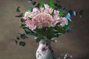
Select a single color family—such as soft blush, deep plum, or muted ivory—to guide the arrangement. This hue should account for roughly 50 to 60 percent of the visual mass. For example, a bouquet centered around pale peach garden roses immediately establishes warmth and softness.
Control saturation intentionally
Dominance does not require brightness. A subdued tone can lead if repeated consistently. Multiple stems in the same hue create coherence even if the color is gentle.
Distribute evenly
Avoid clustering all dominant blooms in one spot. Even distribution prevents visual imbalance and ensures the eye recognizes it as the base layer rather than a single focal patch.
The dominant hue acts as the background voice in a musical composition—steady, consistent, and foundational.
Supporting Colors Create Transition
Once the primary hue is established, secondary tones introduce depth. These colors should relate closely to the dominant hue to avoid abrupt contrast.
Stay adjacent on the color wheel
Analogous colors—those next to each other on the color wheel—naturally blend. For a peach-dominant design, soft coral or muted apricot provide seamless progression.
Vary value rather than hue
Instead of adding entirely new colors, adjust lightness and darkness. Pairing a mid-tone pink with a deeper rose creates gradient movement without disrupting harmony.
Use texture to enhance subtle shifts
Secondary flowers can differ in petal structure or size. For example, pairing rounded roses with delicate spray blooms in a similar shade adds complexity without visual noise.
These supporting tones account for roughly 30 to 40 percent of the composition. Their role is to bridge, not compete.
Accent Colors Define the Focal Point
Accent colors provide contrast and draw immediate attention. However, their power depends on restraint.
Limit quantity
Accent hues should occupy no more than 10 percent of the arrangement. A single deep burgundy dahlia placed among blush tones can command attention precisely because it is rare within the composition.
Position strategically
Place accent blooms slightly off-center to create dynamic focus. Symmetrical placement weakens their impact.
Ensure intentional contrast
Accent colors should contrast in either hue or value. A bright yellow bloom among cool purples generates energy, while a dark bloom among pale tones creates drama.
Without a dominant structure, accent colors feel chaotic. With hierarchy, they become deliberate punctuation.
Guiding the Eye Through Progression
Color layering influences how the viewer's gaze moves across the arrangement.
Create a gradient flow
Arrange hues so they transition gradually from light to dark or warm to cool. Abrupt jumps interrupt visual continuity.
Repeat accents subtly
If using a bold accent, echo it in smaller amounts elsewhere—perhaps through a bud or small cluster—to maintain balance.
Evaluate from distance
Step back two meters and observe. The dominant hue should register first, followed by supporting tones, and finally the accent. If everything appears equally loud, the hierarchy needs refinement.
Professional floral designers often photograph their work in grayscale to assess value contrast. Even without color, clear tonal layering should remain visible.
Color hierarchy transforms arrangement from decoration into composition. It allows flowers to communicate with clarity rather than volume. When dominant hues provide stability, supporting tones create movement, and accents punctuate with intention, the eye relaxes.
Next time you select blooms, resist the urge to combine every beautiful shade available. Choose one color to lead, another to accompany, and a final note to surprise. The discipline of progression will turn scattered beauty into focused expression.